All Projects
Browse, View, or Fork public access projects.
-
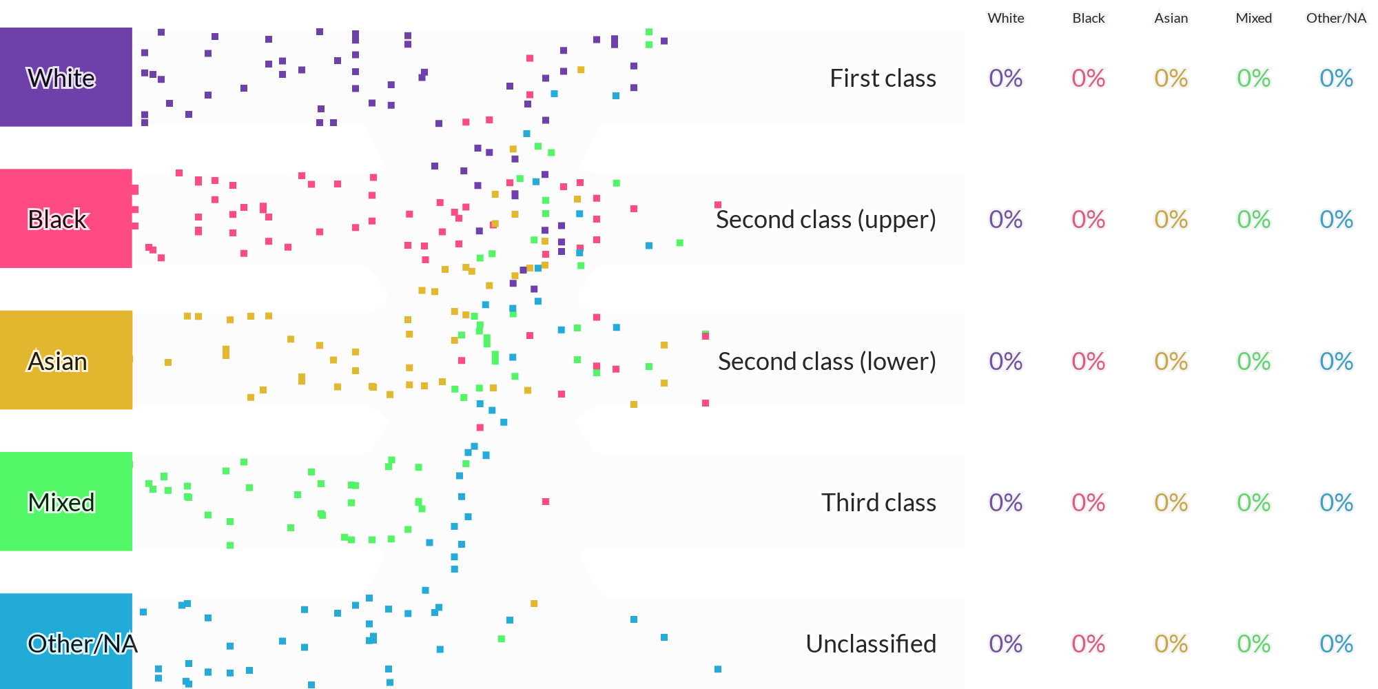
How Do Degree Classes Vary By Graduates' Ethnicity?
Updated 2025-Feb-4 17:32 by the App
-
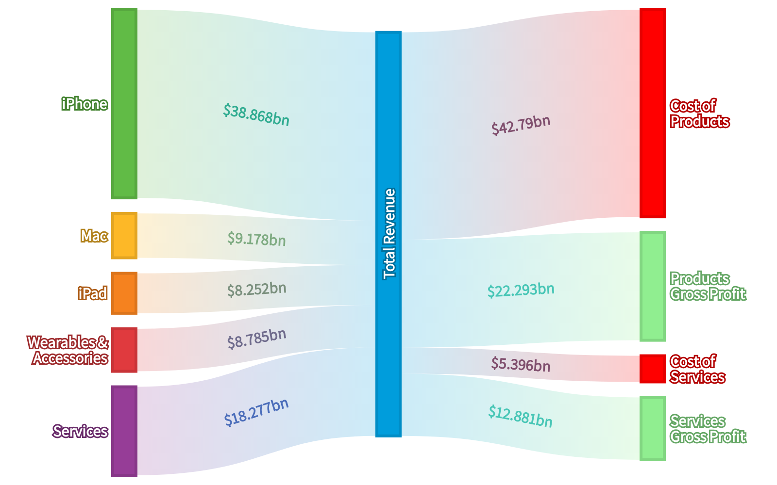
Apple 2021 Q4 Results
Updated 2025-Jan-29 21:57 by the API
-
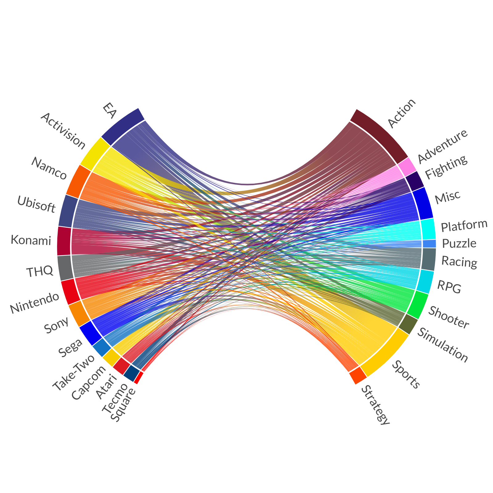
Video Game Publishers and Genres
Updated 2025-Jan-29 21:09 by the API
-
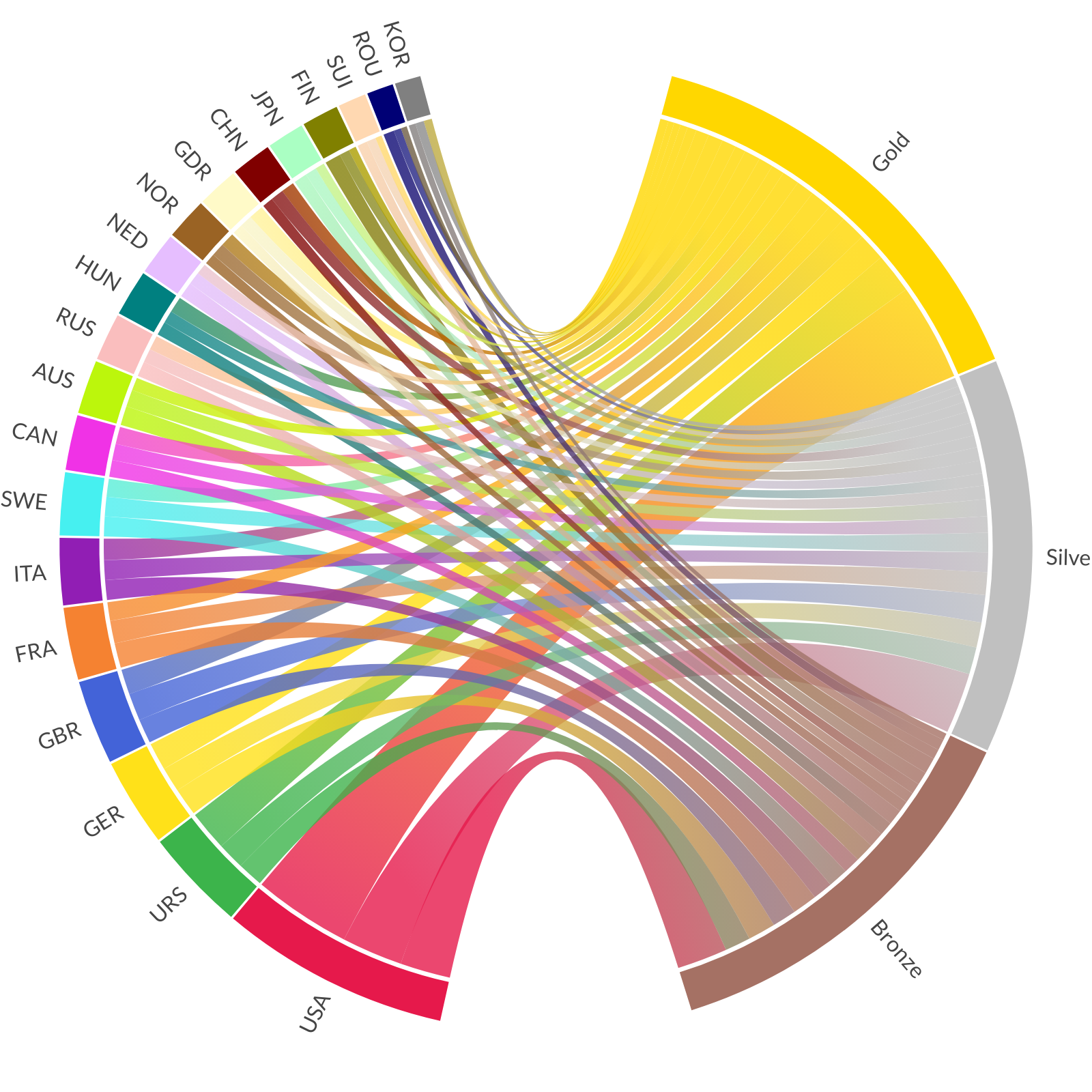
Top Olympic Medal Earning Countries
Updated 2025-Jan-29 21:09 by the API
-
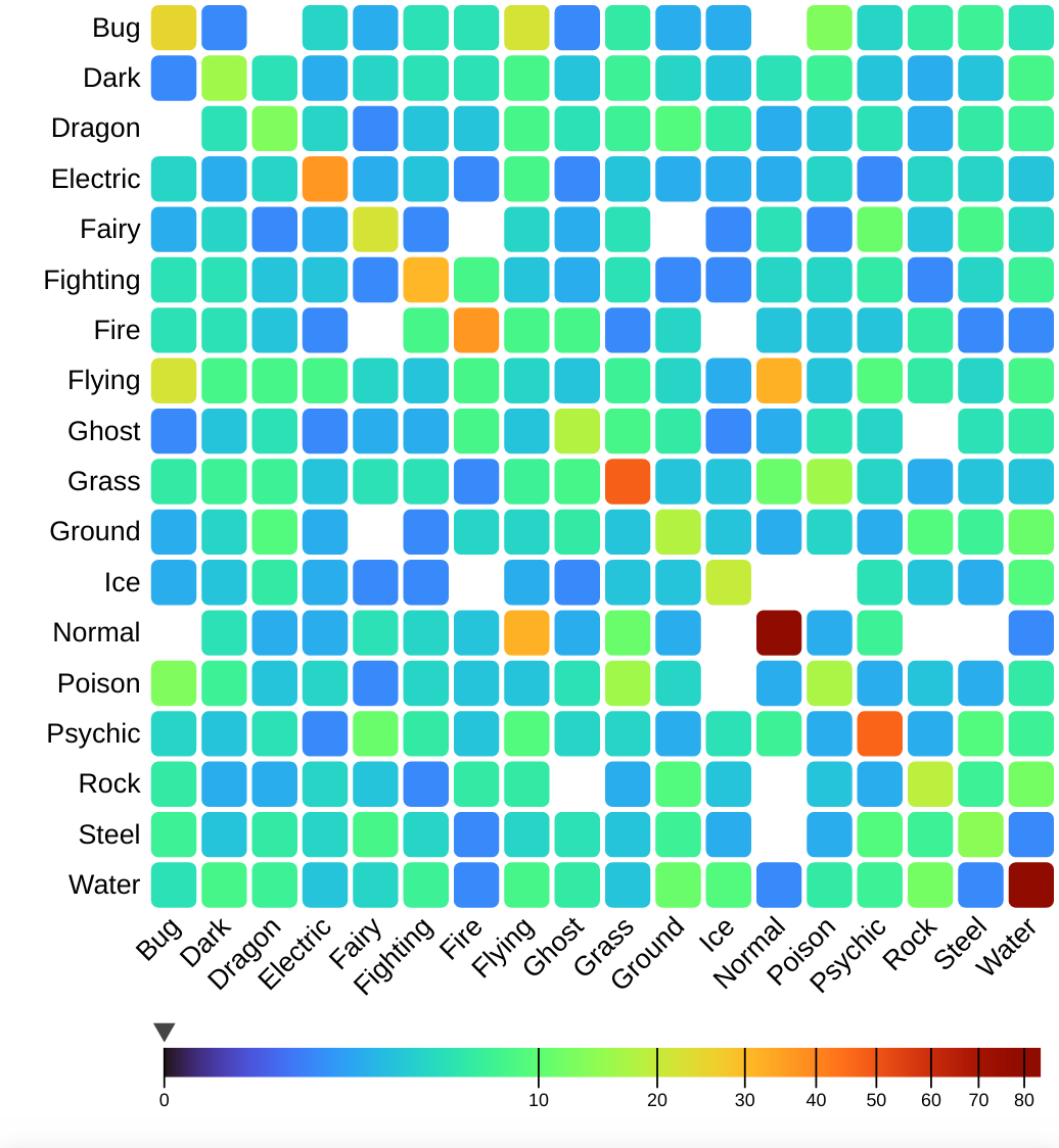
Pokémon Types (Gen 1-9)
Updated 2025-Jan-29 21:09 by the API
-
Pokémon Types (Gen 1-9)
Updated 2025-Jan-29 21:08 by the API
-
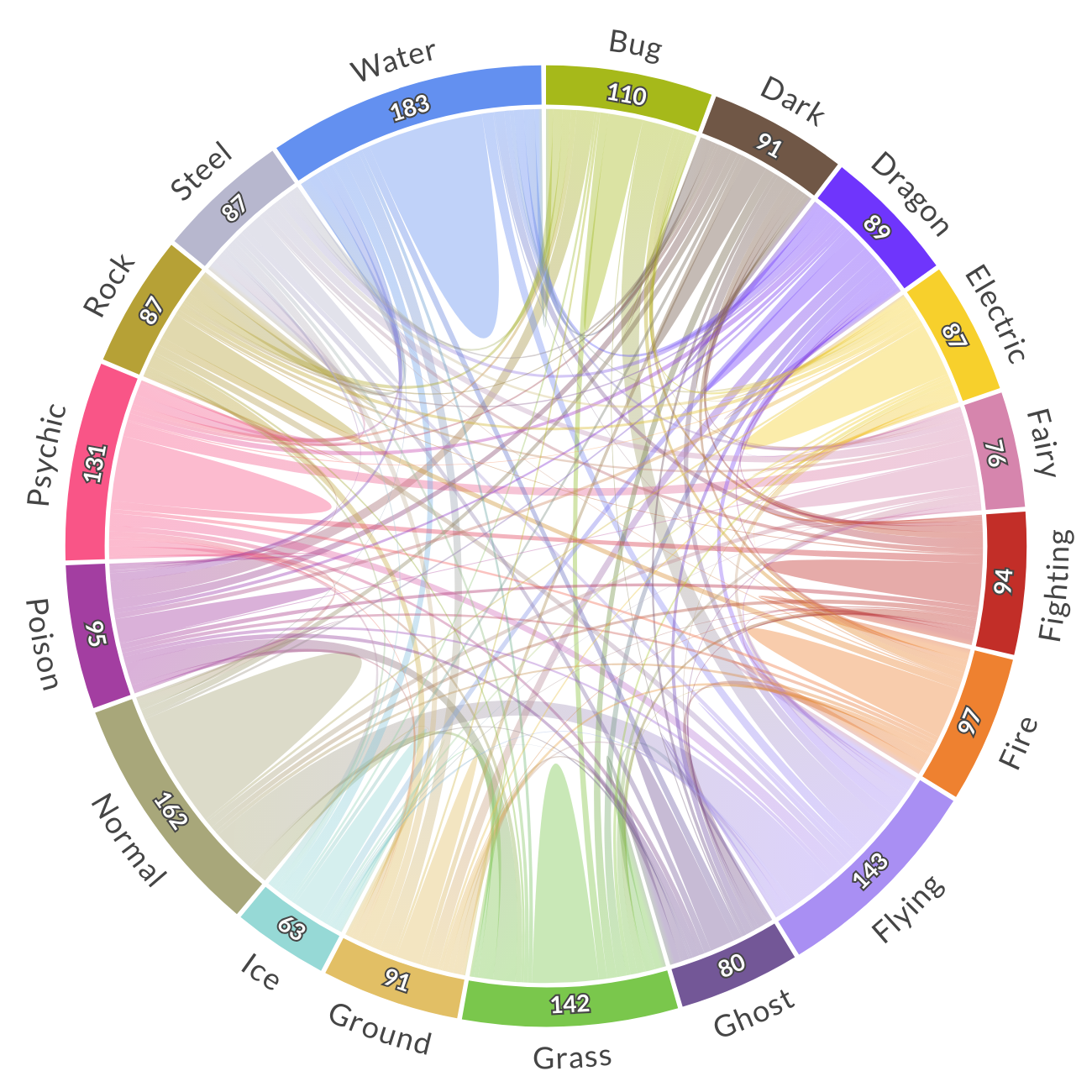
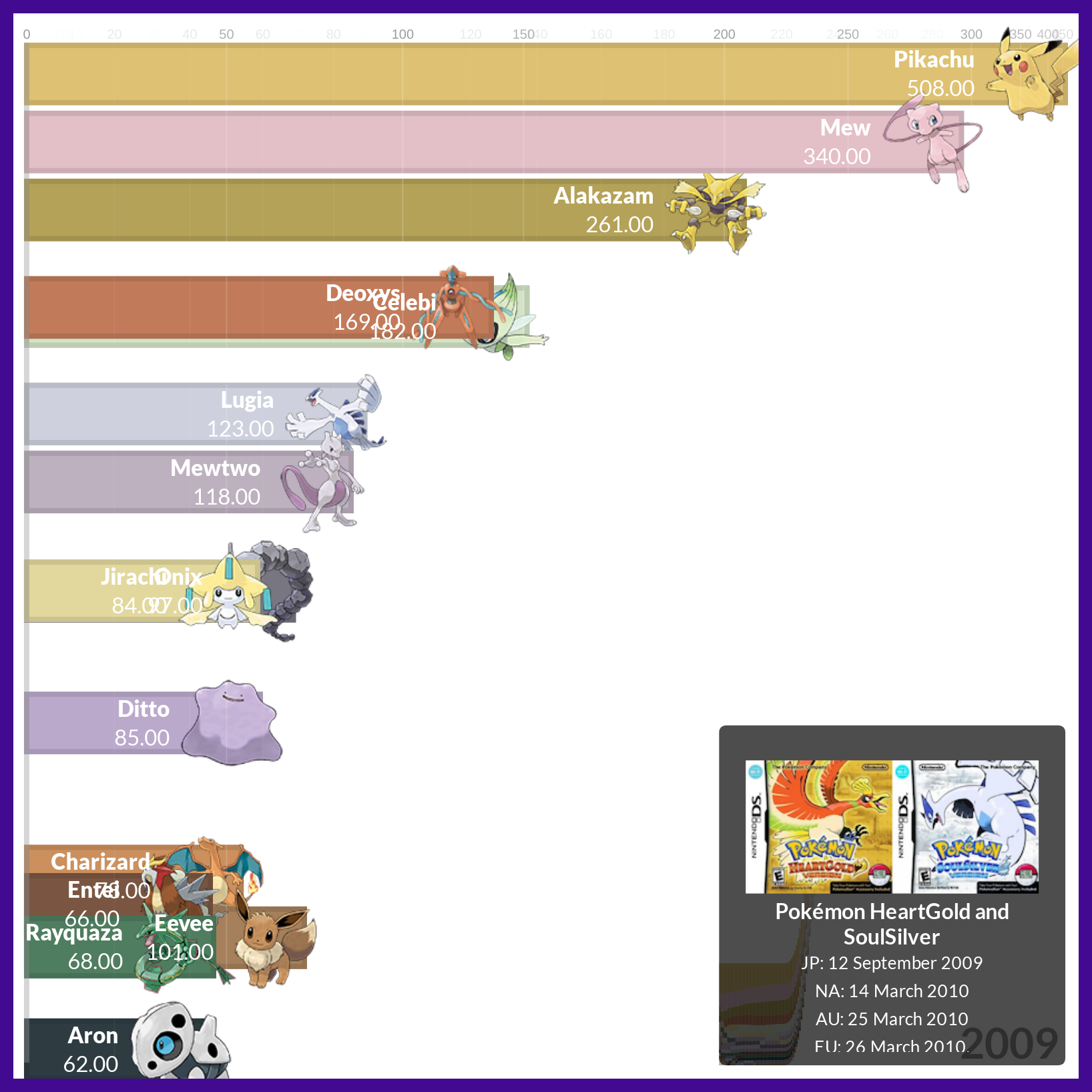
Pokémon Trends
Updated 2025-Jan-29 21:08 by the API
-
League of Legends World Championship
Updated 2025-Jan-29 21:08 by the API
-
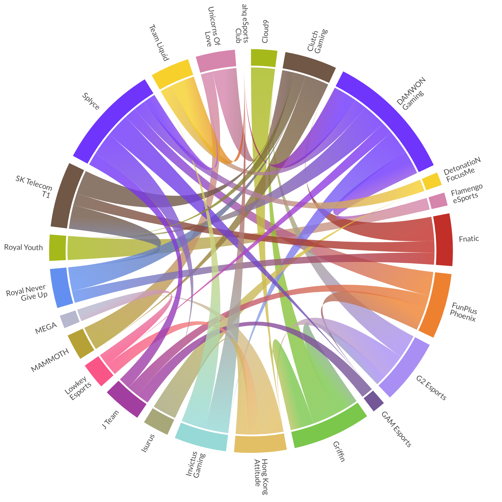
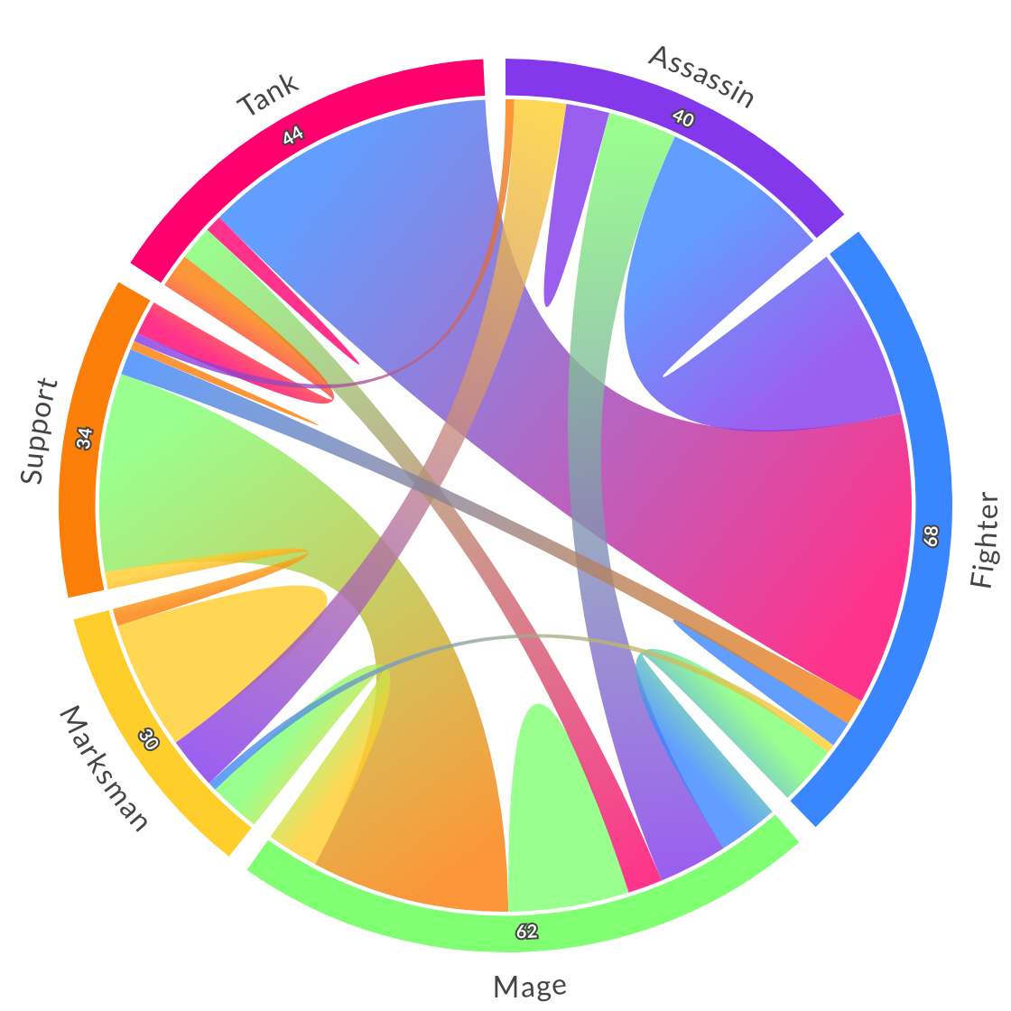
League of Legends Class Combinations
Updated 2025-Jan-29 21:08 by the API